Pure Power
This case study presents the 4th version published on July 2026. Product is still changing.
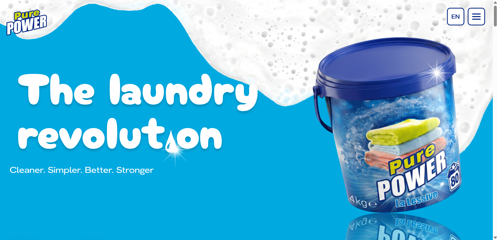
Product overview
PurePower is an emerging laundry detergent brand entering a competitive consumer market. The project consisted of designing and developing a bilingual marketing website supported by a custom content management system, allowing the brand to showcase its products, publish educational content, and prepare for international growth.
Estimated Duration
3 months
Team
Brand stakeholders + Technical Coordinator +
me as Product Designer &
Full-Stack Engineer
Project context
PurePower needed more than a promotional website.
The platform had to communicate the brand's personality while also meeting practical business and
legal requirements. Customers needed easy access to product information and ingredient
transparency, while the marketing team required the flexibility to publish bilingual content
without relying on developers.
At the same time, the brand itself was still taking shape. The website became one of the first
opportunities to define how PurePower should be perceived by future customers.
My role
Working alongside the technical manager and project stakeholders, I translated evolving business expectations into a cohesive digital experience. I was responsible for both the product design and technical implementation.
Product design
- Information architecture
- Landing page
- Product pages
- Blog experience
- Bilingual user experience
Engineering
- Frontend development
- Custom CMS
- Authentication
- Database
- Deployment
The challenge
The biggest challenge wasn't building the website.
It was defining a visual direction that multiple stakeholders could genuinely align around.
Throughout the project, references shifted considerably.
At different moments, the desired direction ranged from:
- cinematic moodboards inspired by towels, foam, and clouds
- premium minimalist brands such as Apple or Aesop
- colorful consumer brands similar to Poppi or Bloom
- traditional retail product presentation
Each direction introduced new expectations, making it difficult to move
confidently into implementation.
The project became as much about facilitating design decisions as creating interfaces.




Product decisions
Building trust through transparency
The website needed to support two very different user intentions. Some
visitors simply wanted to discover the brand. Others wanted detailed product information
before making a purchase. To support both journeys, I organized the experience around
distinct content areas.
Homepage : introduced the brand through a visual-first experience focused on
creating confidence and communicating product quality.
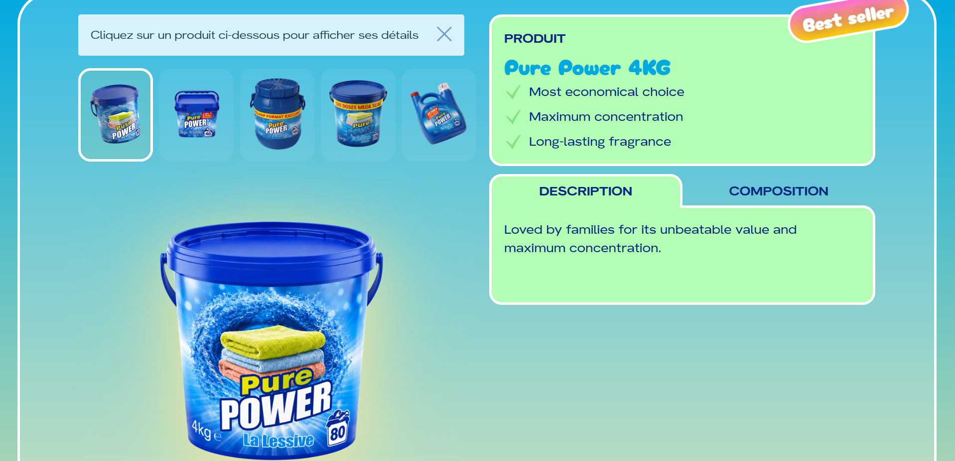
Products page : centralized descriptions, usage information, and ingredient composition, ensuring transparency while satisfying legal publishing requirements.
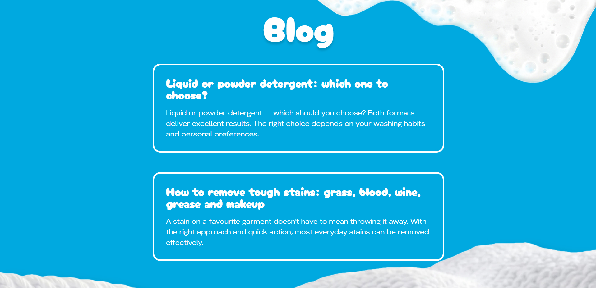
Blog : rather than treating the blog as secondary content, it became an important acquisition channel supporting SEO and future international visibility.
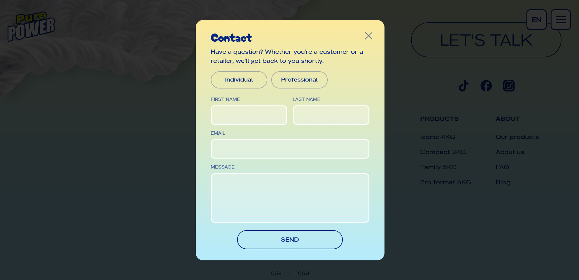
Contact : separate inquiry paths allowed both consumers and business partners to contact the company through a single platform.
Designing through iteration
Unlike many projects where a single visual direction emerges quickly,
PurePower evolved through multiple redesign cycles. Each iteration explored a different
interpretation of the brand.
The process gradually refined:
- typography
- color palette
- product presentation
- visual hierarchy
- storytelling
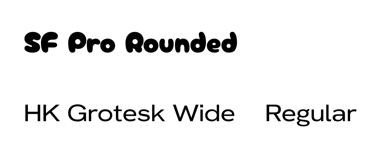
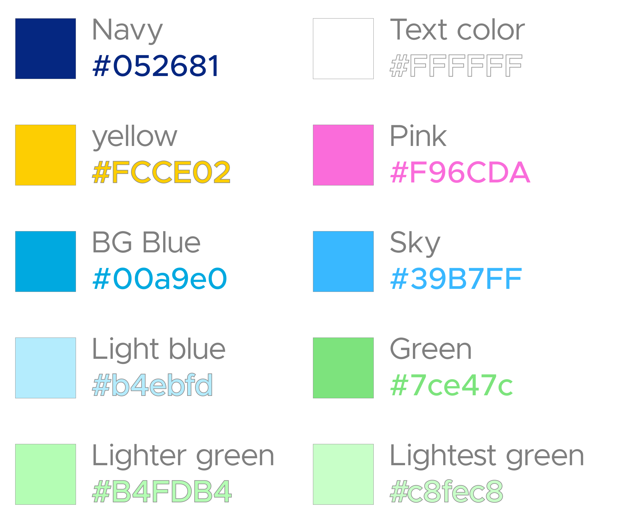
Rather than treating redesign as failure, each version became an opportunity to better understand the stakeholders' expectations.
Engineering decisions
Giving stakeholders editorial autonomy
The marketing team needed to publish bilingual articles without depending on
developers.
To support this, I implemented a lightweight content management system allowing articles to
be created and managed in both English and French.
Using AI-assisted development accelerated implementation while leaving time to focus on the
application's structure and editorial workflow.
Architecture
The platform was intentionally kept lightweight.

This architecture separated content management from the presentation layer while remaining simple enough to maintain.
Technical & product challenges
Aligning multiple stakeholders
The technical implementation remained relatively straightforward. The real
complexity came from decision making.
Although visual references were regularly approved, each stakeholder interpreted those
references differently. A moodboard alone wasn't enough to guarantee alignment.
To overcome this, I shifted from presenting finished mockups to collaborative design
sessions. Rather than debating completed designs, we first agreed on the emotional qualities
the brand should communicate, then refined typography, colors, spacing, and layouts together.
This significantly reduced ambiguity before implementation.
Outcomes
The project resulted in a complete bilingual marketing platform ready for production.
Product
- Website delivered and deployed twice
- Custom bilingual CMS
- Product catalog centralized
- SEO-ready blog structure
Process
- Four major design iterations
- Website delivered across two production releases
- Shared visual direction established with stakeholders
Reflection
This project reinforced that successful product design isn't always about
finding the right visual solution immediately.
Sometimes the greatest value comes from helping stakeholders articulate what they actually want
before pixels are placed on the screen.
One of the biggest lessons was realizing that moodboards alone rarely create alignment. Two
people can approve the same reference while imagining entirely different outcomes.
If I approached the project again, I would spend more time at the beginning defining the
emotional attributes of the brand:such as energetic, trustworthy, playful, or premium:before
exploring visual references. Establishing that shared vocabulary earlier would likely have
reduced redesign cycles while making subsequent design decisions more objective.