Loxymore
This case study presents the version of the product I designed and implemented during my involvement. However it is not online yet.
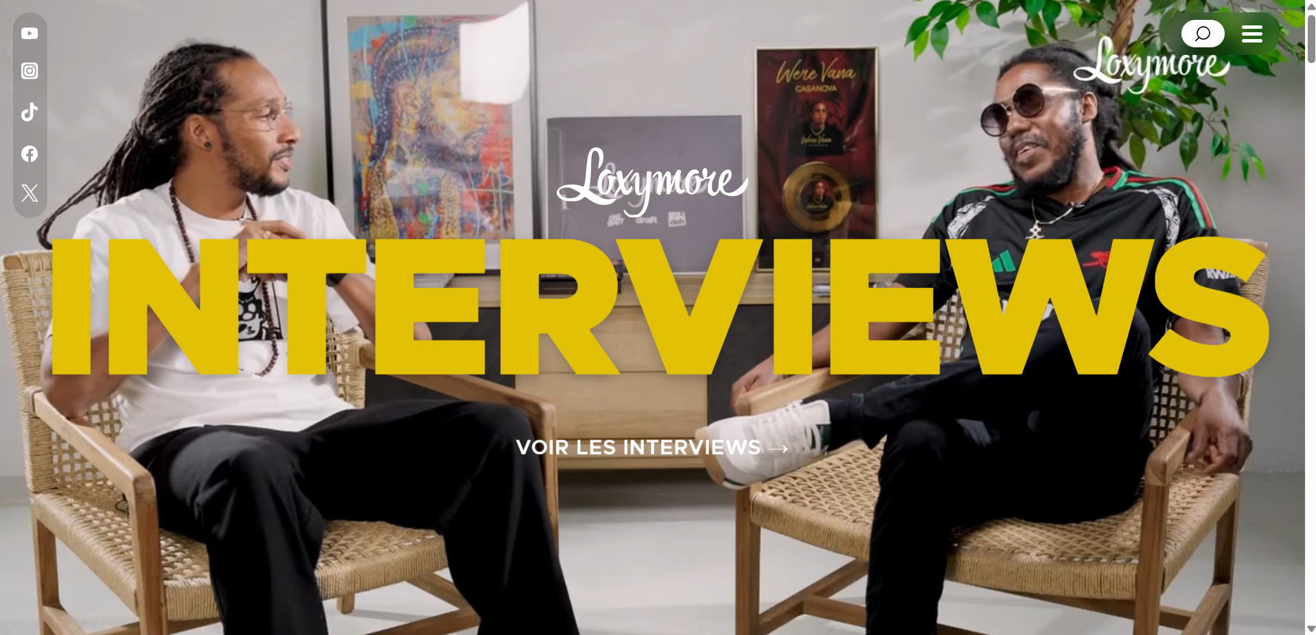
Product overview
Loxymore is a Caribbean urban media brand with an established audience across YouTube, Instagram, TikTok, Spotify, and X. The project consisted of designing and developing an owned digital platform that centralized the brand's content ecosystem, strengthened its credibility, and made its media easier to discover.
Duration
4 months
Team
Project Coordinator + me as Product Designer & Frontend Engineer
Project context
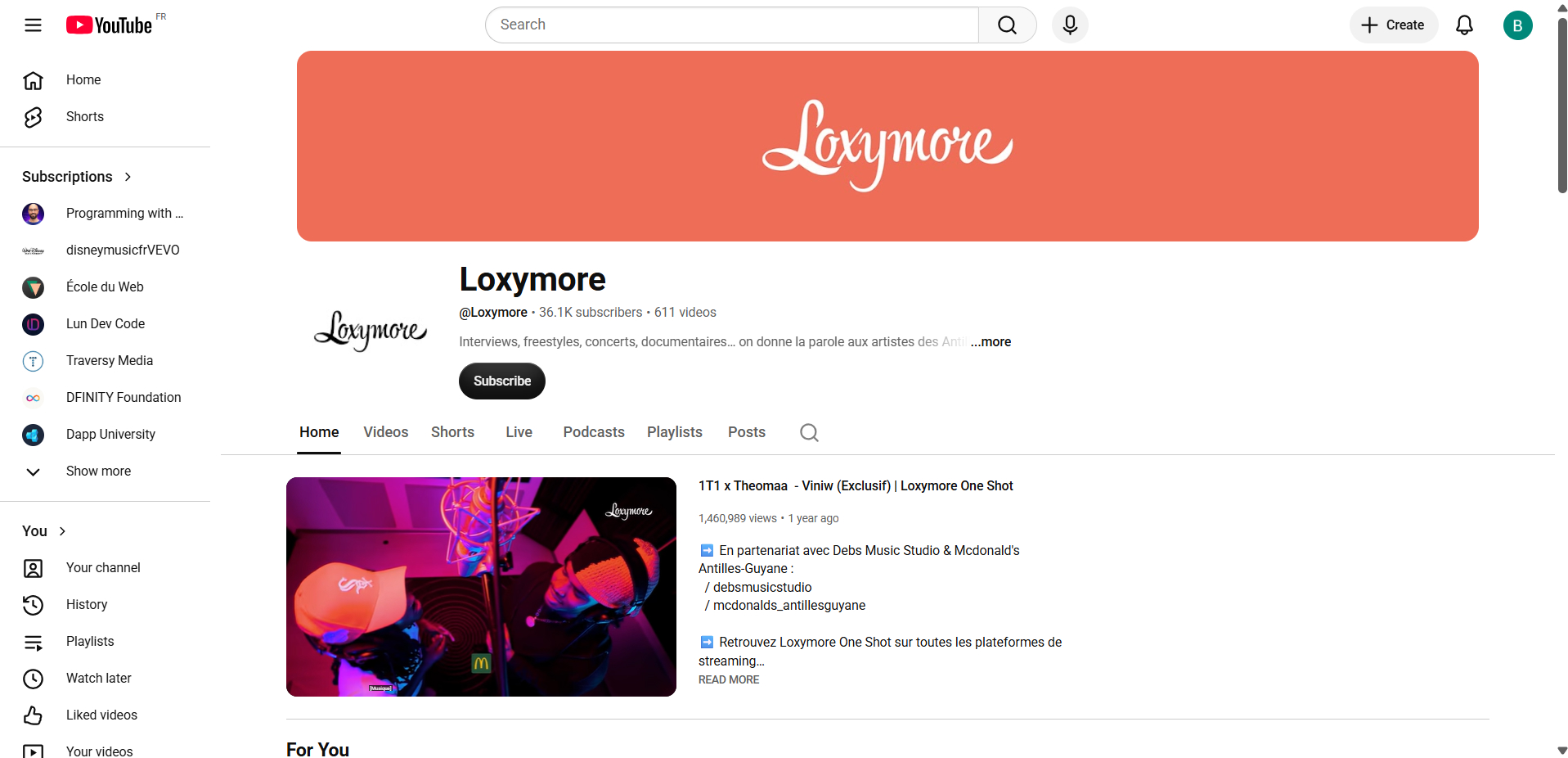
Loxymore had successfully built its audience on social media, where each
platform served a different purpose.
Interviews lived on YouTube, podcasts on Spotify, short-form content on Instagram and TikTok,
while news and conversations happened elsewhere.
Although the audience knew the brand, there was no single destination where new visitors,
artists, or potential partners could understand everything Loxymore offered.
The objective wasn't to replace social media. It was to create a digital home that connected
every platform while reinforcing the brand's identity.
My role
Working directly with the client, I was responsible for translating an established social identity into a dedicated web experience.
Product design
- Information architecture
- Content hierarchy
- Navigation
- Art direction
- Landing page
- Editorial storytelling
Frontend engineering
- Responsive development
- Animations
- API integrations
- Performance optimization
The challenge
The project wasn't simply about displaying social feeds.
The real challenge was helping visitors discover the diversity of Loxymore's content without
forcing them to navigate multiple platforms individually.
The website needed to balance two goals:
- introduce the brand to newcomers
- encourage existing audiences to continue engaging on their preferred platforms
Finding that balance shaped both the user experience and the technical implementation.

Product decisions
Organizing content around familiar formats
Rather than presenting content chronologically, I structured the homepage around the formats the audience already recognized. This included dedicated sections for:
- Interviews
- One Shots
- In Deh Live sessions
- Podcasts
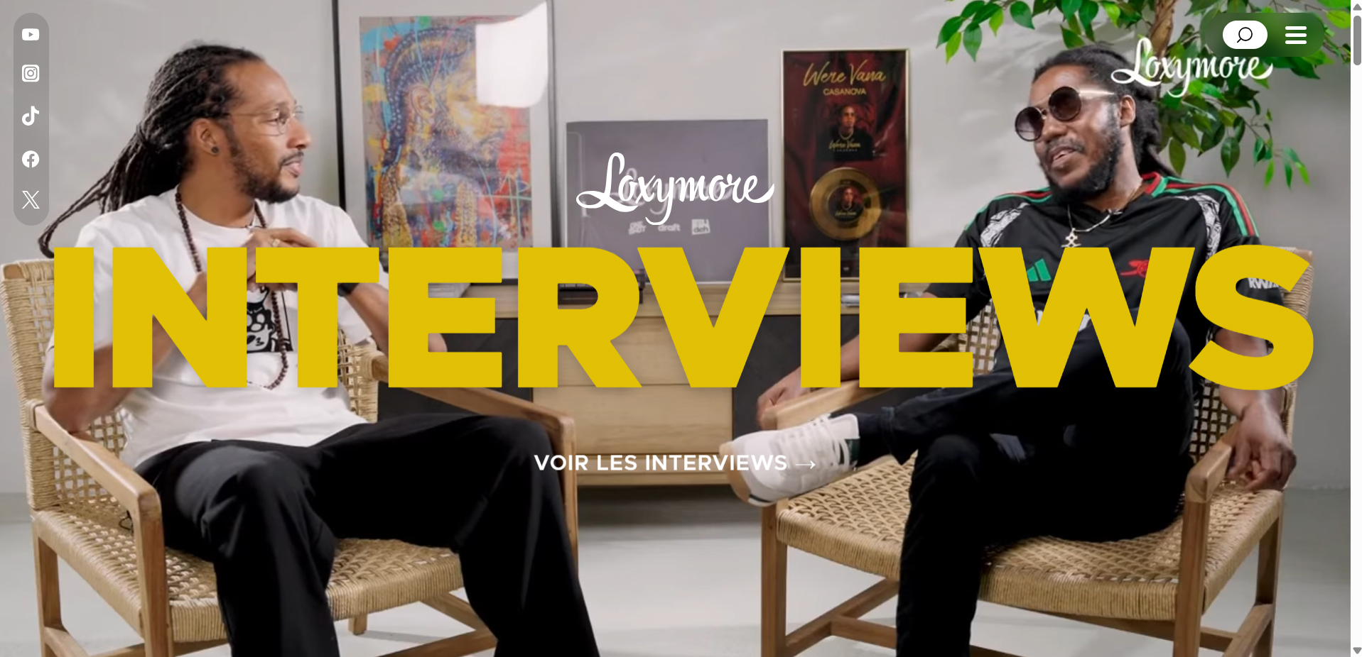
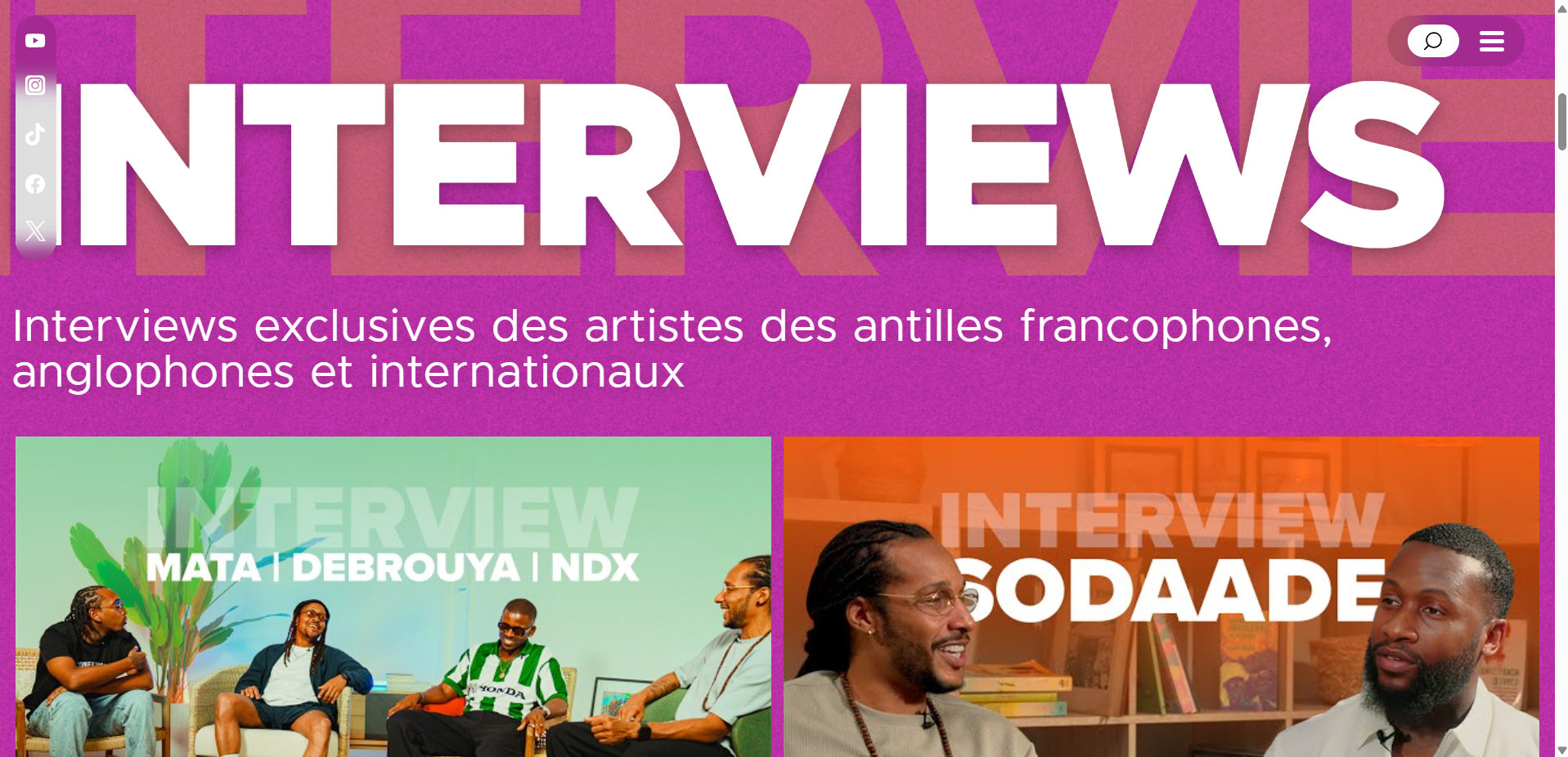
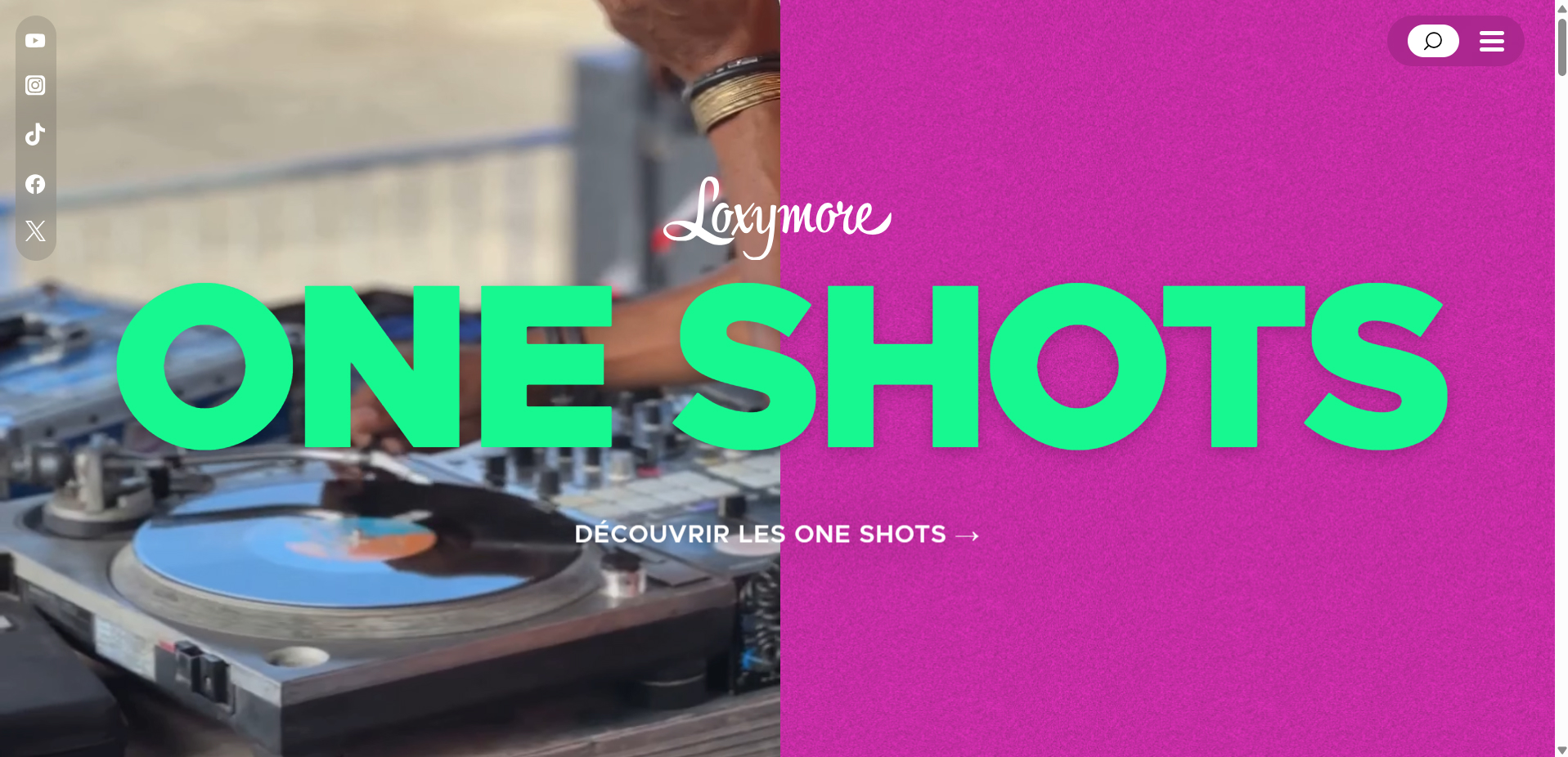
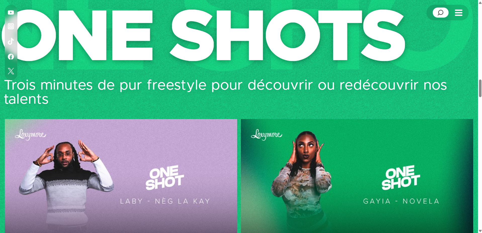
Each section displayed a curated selection of recent content, allowing visitors to quickly discover new material before continuing the experience on YouTube or Spotify.
Going beyond a content hub
During the project, I realized the platform needed more than aggregated
media. Someone discovering Loxymore for the first time had no context about the people
behind the brand or its editorial vision.
I proposed introducing an About page that told the story of Loxymore, presented its
services, and explained its mission.
This transformed the website from a simple content directory into a platform that could
support partnerships, artists, and future business opportunities.

Extending the existing brand
The visual direction intentionally borrowed from the universe users already
associated with Loxymore. Instead of inventing a completely new identity, I translated the
energy of the brand's social presence into a dedicated web experience.
The interface combined:
- vibrant colors
- bold typography
- animated backgrounds
- dynamic transitions
The goal was to make visitors immediately feel they were still within the Loxymore ecosystem.
Engineering decisions
Protecting external APIs
My first implementation connected directly to YouTube and Spotify from the
frontend.
While this accelerated experimentation, it exposed API credentials and wasn't suitable for
production.
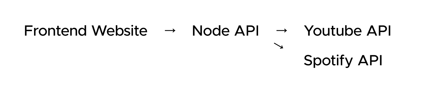
To solve this, I introduced a lightweight Node.js and Express backend responsible for
handling API requests securely before returning only the necessary content to the frontend.
Architecture
The application remained intentionally lightweight.
Frontend website → Node.js API → Spotify & YouTube
Separating API communication from the frontend improved security while simplifying future integrations.
Technical challenges
Balancing media richness and performance
My initial vision for the homepage included several embedded videos to
immediately immerse visitors in the brand.
Although visually engaging, multiple embedded videos significantly slowed page loading once
deployed.
Instead of sacrificing the visual experience entirely, I redesigned the interaction. Rather
than embedding every video directly, the website retrieved thumbnails and metadata while
linking users to the original content on YouTube.
This preserved the browsing experience while dramatically improving loading performance.
Optimizing third-party content
Embedding multiple YouTube iframes introduced additional rendering delays.
Replacing most embeds with lightweight previews reduced unnecessary requests and created a
faster, more responsive homepage without compromising discoverability.
Outcomes
The project successfully established an owned digital presence for the brand.
Product
- Responsive website approved, waiting for launch
- Media content centralized
- Editorial content introduced
- Social ecosystem connected
Engineering
- Secure API integrations
- Improved loading performance
- Lightweight architecture
- Optimized media delivery
Reflection
This project reinforced that a website doesn't always need to compete with
existing platforms to create value.
For social-first brands, an owned digital experience can serve as a gateway rather than a
destination:helping visitors understand the brand, discover content more easily, and navigate an
ecosystem that would otherwise feel fragmented.
Looking back, one improvement I would explore would be introducing a caching strategy or
automated synchronization pipeline for YouTube and Spotify content. This would reduce external
API requests while keeping the catalog consistently up to date.